Independent
Curators
International
Optimizing ICI’s Digital Experience
Enhancing Navigation and Content Accessibility to Empower Curators and Boost Engagement
Role
UX Research
UI Design
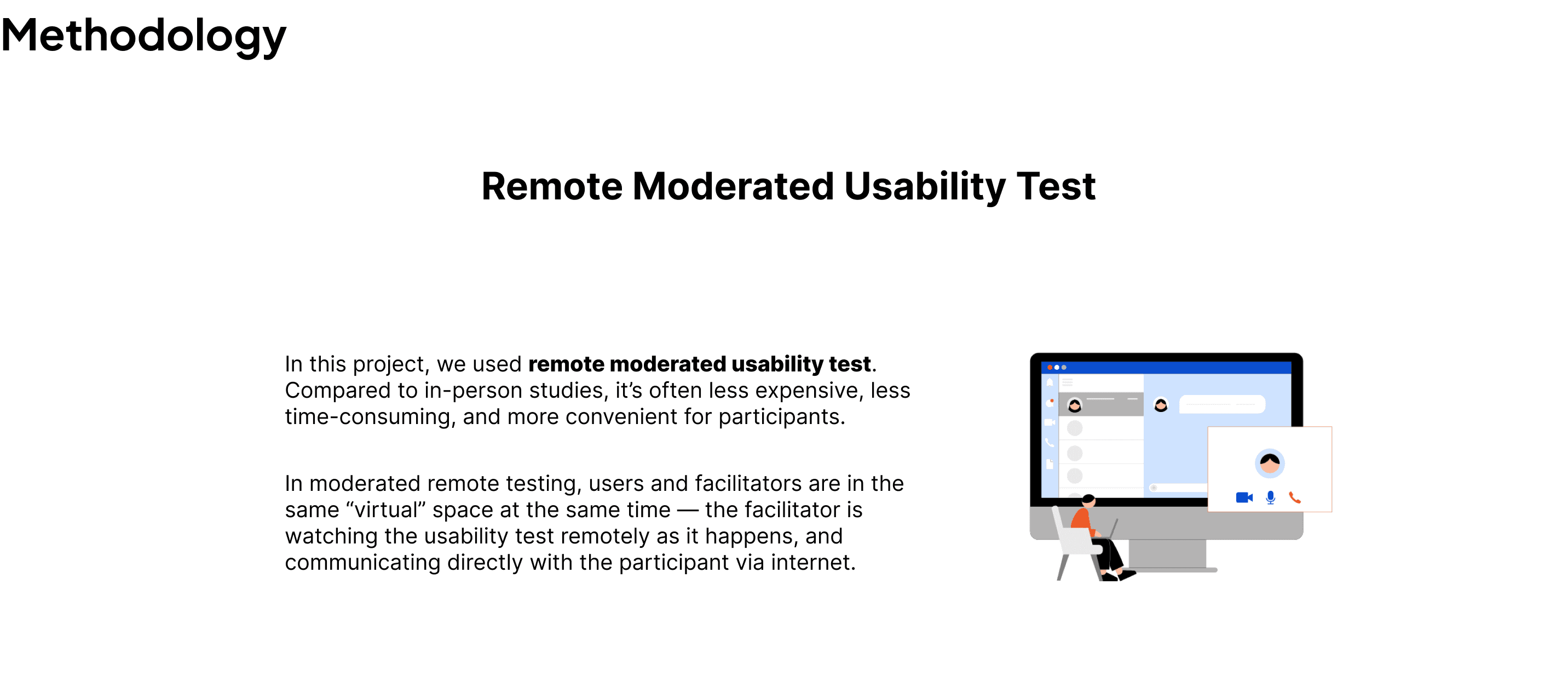
Moderated User Testing
Worked with:
Digital Content Manager
Timeline
Nov - Dec 2023
Client
Independent Curators International
Team
Cathelyna Suherman, Madhumitha Pradeep, Nallammai Kannan,
Chieh Lei
Tool
Figma,
Google SpreadSheet
Project Overview
Independent Curators International (ICI) is a non-profit arts organization that supports curators. ICI connects curators from across the world, and provides many resources, including fellowships, intensives, and seminars.
Problem
Independent Curators International (ICI) lacks a clear understanding of the preferences and interests of their audience. ICI hopes to understand the types of content that are effective and ineffective for their audience.
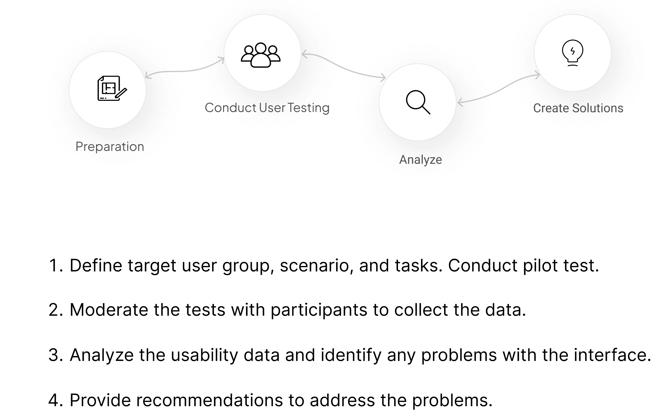
Provide Comprehensive User Experience Analysis for ICI Website Optimization
Conduct moderated user testing to understand navigation patterns and content evaluation.
Provide usability report and presentation about key findings and recommendations
Project Goal
Area For
Improvements
Navigation Bar
Interactive Image Cues
Application Status Visibility
Content Density and Placement
Participants faced challenges in navigating the website, particularly with the jargon in the navigation bar.
Lack of visual cues for clickable images led to confusion.
Participants faced difficulty understanding which programs were current and accepting applications.
Some participants found the content text-heavy, suggesting the inclusion of summaries or blurbs.
Uncovering Problems Through Usability Testing
1. Reorganizing the Navigation Bar
Users struggled to find ICI’s professional development programs—one of the organization’s core offerings. Inconsistencies in capitalization and spacing added to the confusion.
Our Fix:
Standardized capitalization for clarity.
Renamed “Learning” → “Programs” to align with user expectations.
Moved the ICI logo to the left, reinforcing its role as a homepage shortcut.
2. Enhancing Interactive Cues
While users appreciated the clean aesthetic, they noted a lack of hover indicators for images, making it unclear what was clickable.
Our Fix:
Introduced a darker overlay on hover for images, aligning with UI best practices.
Maintained visual simplicity while improving interactive clarity.
3. Clarifying Exhibition Timing for Better User Expectations
Users were frustrated when exhibition details didn’t meet their expectations—especially when dates were unclear. Some only realized events were too far in the future after clicking.
Our Fix:
Added a “Future” tab to separate exhibitions scheduled beyond three months.
Displayed exhibition dates directly on cards, allowing for quick assessment.
4. Introducing Overview Sections for Quick Access and Informed Decision-Making
Content-heavy exhibition pages overwhelmed users, reducing readability and engagement.
Our Fix:
Introduced dedicated overview section at the top of pages, letting users quickly grasp key details and efficiently decide whether to delve into the “DETAILS” section for deeper insights.
5. Elevating Call-to-Action for Open Applications
Users struggled to find active programs with open applications. As one participant put it, “If they're calling for applications, it should be at the top.”
Our Fix:
Created a dedicated “Open Applications” page, aggregating all available opportunities.
Linked this page prominently at the top of program sections for easy discovery.
By tackling these usability challenges, we helped ICI create a more intuitive, engaging, and accessible digital experience—one where users can navigate effortlessly, find relevant content, and take action with confidence.
The Impact
After interviewing 8 participants
Key UX Improvements for ICI
Participants praised ICI’s clean, minimalist design, describing it as beautiful and culturally engaging. However, we uncovered five key usability issues that impacted navigation, clarity, and engagement.
Participant Information

Key Findings

Voice from Participants
Makes me want to get involved, love it.
Nice website.
I expected it under 'About,' but couldn’t find it quickly—so I usually Google it instead.
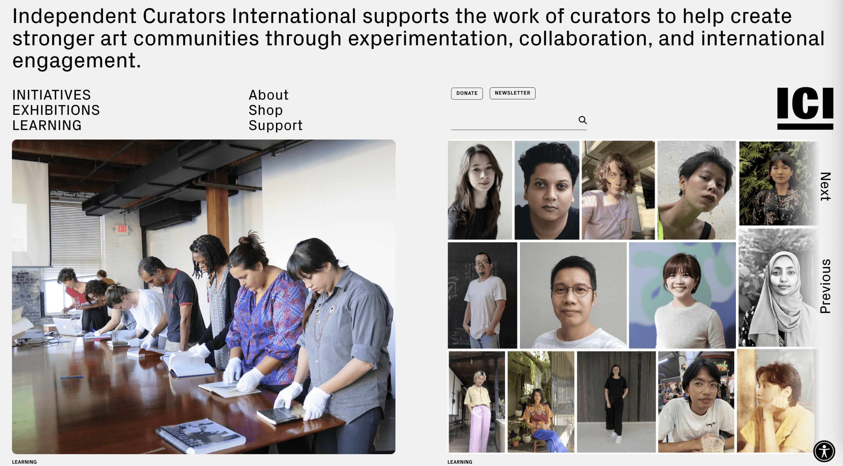
Participant Recruitment
ICI Alumni
Aspiring
Curators
Art
Enthusiasts
People who are familiar with curating
In this study, we discussed the target user profile with Taylor Black, a Communications and Digital Content Manager at ICI. After that, we came up with the following target user group:

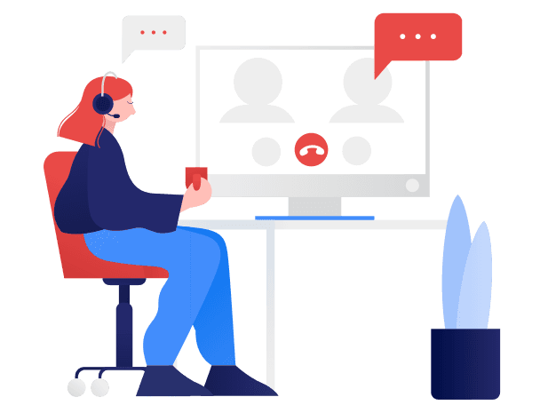
Screenshot of a moderated usability test in progress
Scenario
You’re an aspiring curator hoping to broaden your network and discover new programs to grow your skills. You want to utilize the Independent Curators International (ICI) website to assist you in this journey.
Tasks


Process


“This is amazing! I’m so impressed by how many insights you are able to generate in such a short time and with limited user pool.
The recommendation you provide is insightful and is a really helpful thing that I'm excited to noodle on in our thinking”
Client Feedback
