
Faster onboarding.
Increased efficiency.
Better navigation experience.
Results
Standardizing IMDb UI Components
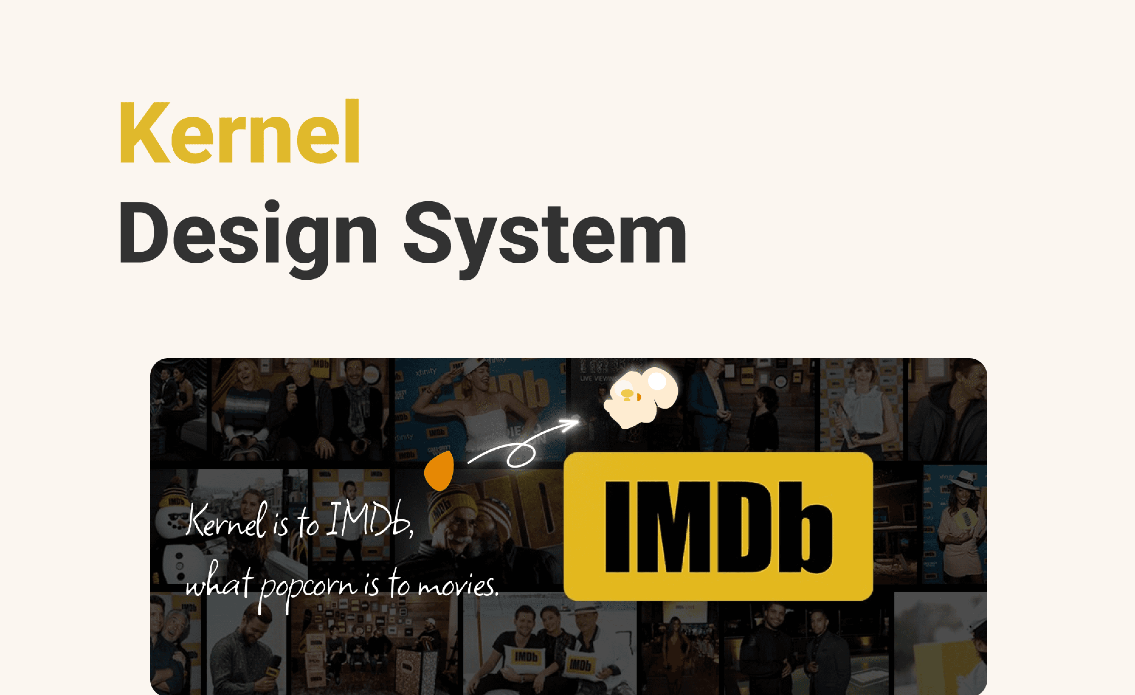
Building The Kernel Design System
Role
Product Designer,
Content Strategy
Team
Radhika Phansalkar,
Smridhi Gupta
Tool
Figma,
Zeroheight
Timeline
Oct - Dec 2024
Disjointed User Experience, Disconnected Team Collaboration
Problem
IMDb’s interface had evolved over time, but with growth came complexity. Inconsistent UI patterns, accessibility shortcomings, and a lack of centralized documentation made it challenging to maintain a seamless user experience. Without a structured system, design and development efforts became fragmented—resulting in inefficiencies and usability challenges.
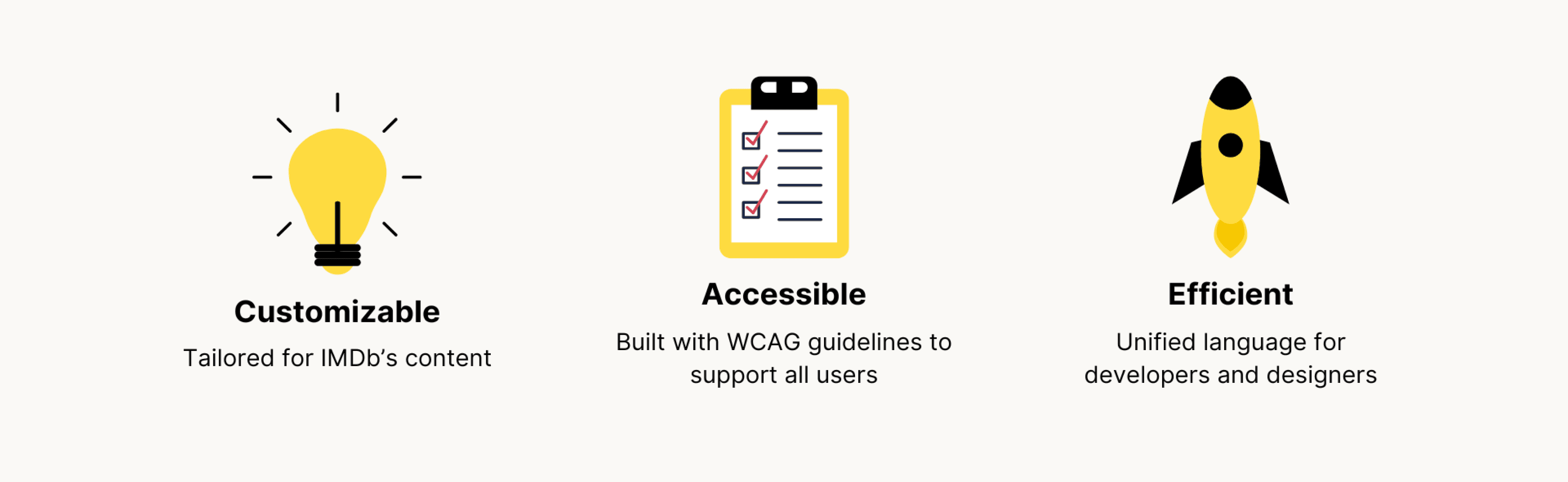
We needed a design system that would unify IMDb’s digital experience, enabling consistency, efficiency, and accessibility across all platforms.
Why IMDb Needed a Design System System
Context


Problem #1
UI elements like buttons varied widely across pages.
Problem #4
Non-standardized components led to redundant work and inconsistent visual experiences.
Problem #2
Complex layouts and inconsistent navigation increased mental effort.
Problem #3
Insufficient alt text and improper heading structure made it difficult for users with disabilities to navigate and understand content.


A Comprehensive Design System with Documentation
Our Solution


Now, let’s start from the beginning to see how we arrived at our solution!
🤔
Deconstruct & Build a UI Inventory
Process 01
Standardize & Implement a Scalable System
Process 02
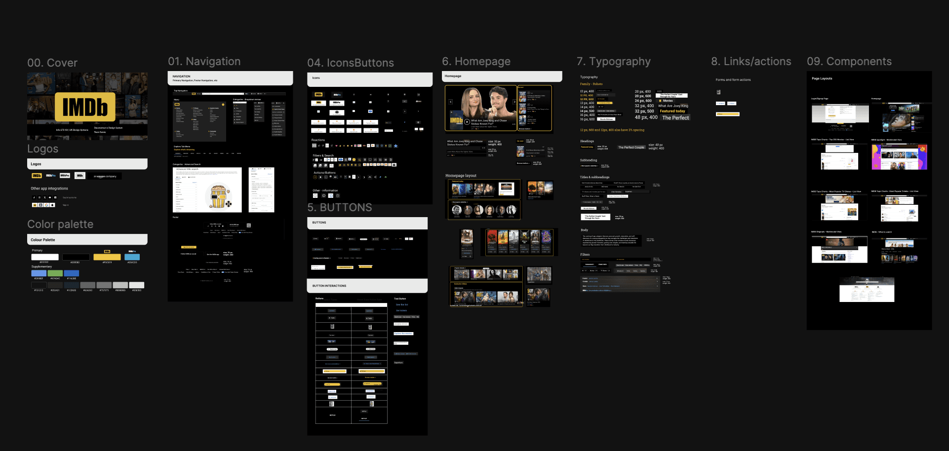
Building Kernel – IMDb’s Unified Design System
Solution
We began by conducting a comprehensive UI audit across IMDb’s core pages, identifying key design flaws, accessibility issues, and inconsistencies that negatively impacted both user experience and development workflows. This deep dive revealed the following challenges:
Lack of Consistent Design Patterns
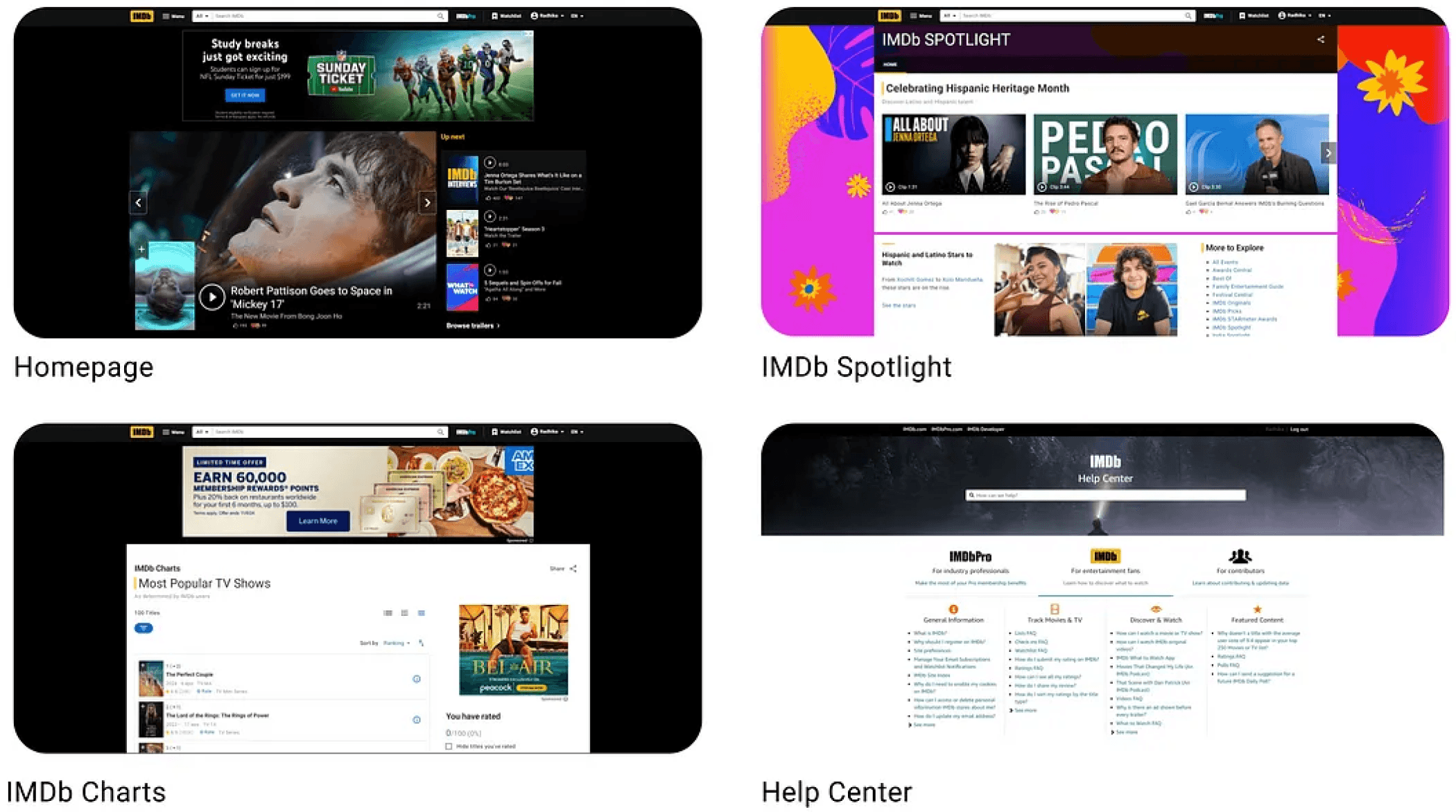
The absence of a cohesive design system led to varying interactions across different sections, such as the Help Center, which had an entirely different layout, color scheme, and typography from the rest of the platform. This inconsistency created a fragmented and frustrating experience for users.
Irregular Page Themes
Movie detail pages had inconsistent layouts, background colors, and design elements, leading to visual disruption and increasing cognitive load.
Non-Standard Components
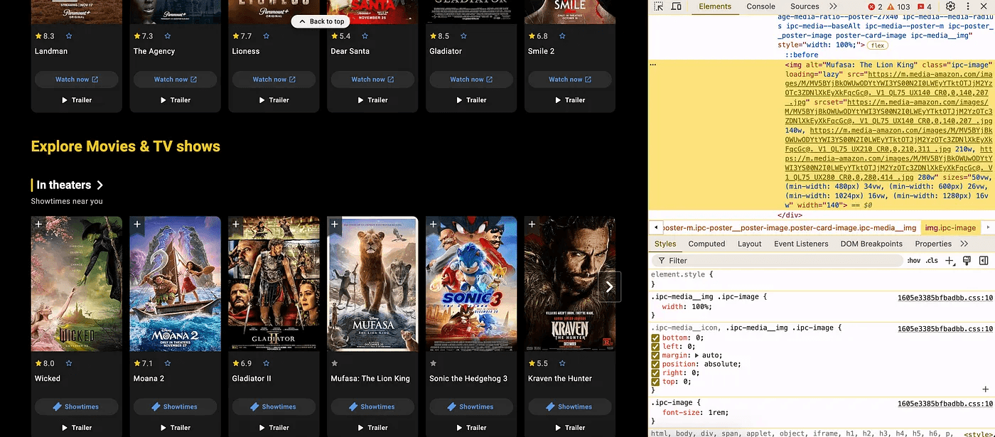
UI elements, particularly cards, varied significantly even within the same type, forcing users to adapt to varying styles and behaviors across the platform. For example, the Home Page had different card styles, confusing users.
Challenge #1
These inconsistencies created a complex and frustrating experience for users, making it difficult to navigate the platform efficiently.
Inconsistent UI and
Cognitive Overload for Users


Disorganized Heading Structure
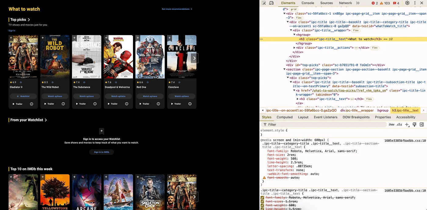
Improper use of headings across the platform, such as using the same
tag for different sections, ignored the content hierarchy and made navigation difficult for users relying on assistive technologies. This violated WCAG 1.3.1 guidelines for info and relationships.
Insufficient Alt Text
Alt text for images, particularly movie posters, was either minimal or non-descriptive, failing to convey essential visual context. This violated WCAG 1.1.1 guidelines for non-text content and reduced accessibility for users relying on screen readers.
Challenge #2
IMDb’s design fell short of meeting accessibility standards, limiting inclusivity and disadvantaging users with disabilities.
Accessibility Shortcomings

By breaking down these issues into manageable components, we could systematically address them through the application of Atomic Design principles, ensuring a more cohesive, accessible, and user-friendly platform.
💡
UI Inventory
User Testing & Refinements
Process 03
After building and implementing the Kernel Design System, we conducted in-person user testing with six participants to assess its usability, clarity, and effectiveness. The goal was to understand how well the system addressed the identified issues and how easily users could adopt the new design patterns.
Findings from User Testing:
During the testing, participants were asked to recreate IMDb’s homepage using The Kernel Design System. While the system itself was effective and provided a more consistent and streamlined approach, one key challenge emerged: onboarding clarity. Novice users, unfamiliar with design systems, found it difficult to navigate the documentation and determine where to begin. This hindered their ability to quickly adopt the system and build their designs effectively.
Task
Recreate IMDb’s homepage using The Kernel Design System.


Next, we unified the design elements into a comprehensive component library, standardizing buttons, typography, color tokens, and layout structures.
Key Takeaways
Impactful Design Systems Drive Consistency & Efficiency – Having a structured approach saves time and reduces design debt.
Accessibility is Non-Negotiable – A truly great design system prioritizes inclusivity, benefiting all users.
Adoption Matters – A design system is only effective if teams use it, so documentation and onboarding are crucial.
Refinements After User Testing
To address this, we created a documentation on Zeroheight and implemented Enhanced Onboarding: a step-by-step demo to master the Kernel Design System. These updates helped bridge the gap between system functionality and user comprehension, enabling users to build designs with greater ease and confidence.
ZeroHeight Documentation:
We created detailed documentation on ZeroHeight, which included design principles, component guidelines, and best practices to ensure consistency and clarity in the use of the Kernel Design System.
Beyond Text Instructions:
We added a concise video tutorial to visually guide users through the setup process and component usage.
Streamlined Learning Process:
This ensured users of all experience levels could confidently navigate the system, reducing confusion and speeding up adoption.
These updates helped bridge the gap between system functionality and user comprehension, allowing users to build designs with ease and confidence.


UI inconsistencies across pages made navigation and interaction unpredictable.
Accessibility shortcomings—low contrast, missing alt text, and inconsistent heading structures created usability barriers.
Scattered UI patterns—Teams lacked a shared system, leading to redundant work and inconsistencies.
Lack of documentation made onboarding difficult for new team members, slowing down adoption.
A structured UI inventory helps designers and developers work more efficiently with reusable components.
Comprehensive documentation in ZeroHeight provides clear onboarding guides and design principles for seamless adoption.
A unified design language ensures consistency across all interfaces.
Clear accessibility principles improve usability for all users, ensuring WCAG compliance.
Before
After
Our Key Features
Standardizing Color & Typography
Streamlining UI Components

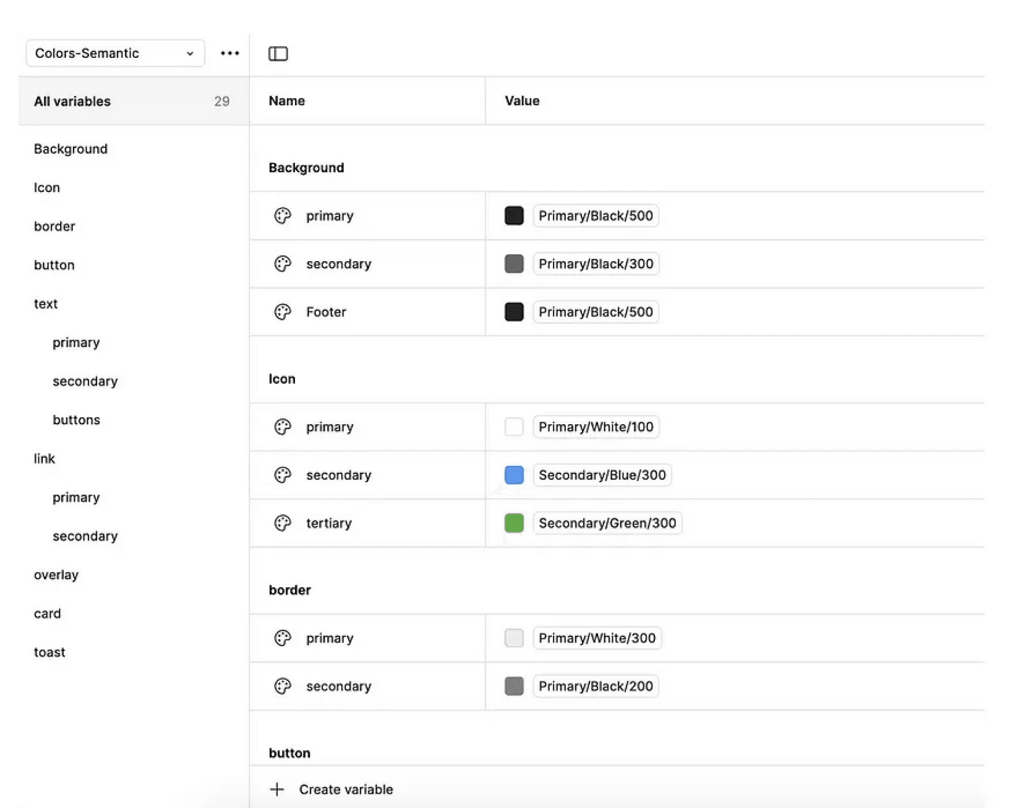
We standardized IMDb’s color palette and typography system to create a cohesive, accessible visual identity. The new color palette aligns with the brand’s language and meets accessibility standards for better readability. We also established a clear typographic hierarchy with consistent font sizes, weights, and spacing across components. These updates provide a unified interface and reusable design tokens for easier future updates.
We unified card components by eliminating inconsistencies in icons and layouts. Through a comprehensive audit, we created a single, reusable card design, extending to carousels and interactive elements. This enhances visual consistency, builds user trust, and streamlines development workflows for more efficient updates.

A Systematic Approach
Deconstruct & Build a UI Inventory
Standardize & Implement a Scalable System
User Testing & Refinement
Documentation & Enhancements
The Process
To address IMDb's design inconsistencies, we adopted Atomic Design principles, breaking down complex issues into manageable components and rebuilding a scalable, unified design system that streamlined workflows, ensured accessibility, and improved scalability.
01
02
03
04
Key Insight: Standardizing components reduced design inconsistencies, enhanced usability, and improved accessibility.
💡
Outcome & Impact
Kernel Design System
Key Transformations in Movie Detail Pages with Kernel
Decluttering Through Visual Hierarchy --> We restructured content placement, prioritized key information (title, ratings, synopsis), and streamlined spacing to eliminate cognitive overload. Users can now quickly find what matters without wading through unnecessary distractions.
Establishing Consistency Across Pages --> We enforced a unified structure for all movie detail pages, eliminating layout discrepancies, inconsistent background colors, and shifting UI elements. This consistency enhances user trust and improves navigation efficiency.
Optimizing Content for Engagement --> By refining typography, contrast, and media presentation, we made movie details more scannable and digestible. Users can now absorb information effortlessly while remaining immersed in IMDb’s rich content ecosystem.
Before
After
Introducing The Kernel Design System
Design Tokens for Consistency and Scalability (Figma Community)
Comprehensive Design System Documentation (ZeroHeight)


Documentation & Accessibility Enhancements
Process 04
To ensure scalability, long-term adoption, and seamless integration, we created a comprehensive design system in ZeroHeight. This included detailed documentation covering:
Additionally, we prioritized accessibility best practices, ensuring the system included:
Clear contrast and focus states to improve usability for all users.
Alt text guidelines to support screen reader users and ensure a more inclusive experience.

